 Erik Frenken of Avelon
In conversation with Erik Frenken
It is no secret that using contrasted elements – like mixing fine and rough fabrics, using soft materials with tailored shapes and merging street attitude with high-end fashion – often make for the most interesting designs out there. But finding the energy created at these points of friction, and translating it into wearable collections is not an easy thing to master. Designer Erik Frenken of the Dutch label Avelon manages to funnel precisely this energy into beautiful and utterly wearable collections season after season. Often finding inspiration for his creations in the visual arts, Frenken offers surprising yet convincing interpretations to visual material that we, here at Sleek, also engage with. So naturally, when he came to Berlin, we were excited to speak with Frenken about his – as we found out – very hands-on, artistic methods:
Sleek: We’ve already featured Avelon’s pre-summer 2014 collection online, as we love how it was inspired by the photography of Wolfgang Tillmans. Can you tell us a bit about what drew you to his work?
Erik Frenken: In fact, both the main summer collection and the pre-summer collection 2014 were inspired by Tillmans, but we divided them into two parts. The main collection uses softer pastel colours, while the pre collection is more street-influenced, and a bit tougher. We wanted to offer a different interpretation of the same thought later in the season.
I discovered Tillman’s work when I was a student at St. Martins, and what I found so interesting was that he could make the most basic, everyday-life things seem so special. He has this way of working with the coincidences of everyday life, those great unplanned moments, and really make something out of them; he’s able to capture them and make one aware of them.
So, practically, what it meant was that I started draping on the mannequin, and when a nice mistake happened, I would take it and make something around it. Like this skirt that has a front panel hanging. It’s a deconstruction on the garment, which started as a mistake and was developed into a concept.
That’s regarding the shapes. What about the prints?
In the Pre-Summer collection it was the leopard print, which we tried to make an everyday version of. The print is actually made with a paint brush – we dotted a large paper and scanned the pattern into the computer. We manipulated it, and printed it, and then sprayed again on top. It’s our version of a homemade-paintbrush-leopard print.
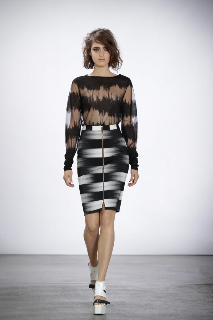
For the main summer collection, we made a print which started from drawing lines with pencil on paper, repeatedly. Then we scanned it, and manipulated it digitally, cutting and mirroring the pattern. We really turned it into an artwork. Then we blew it up, and got this irregular pattern. We used it on knitwear, which we printed with a chemical that burns away the cotton, so only the polyester stays. That’s how you get the sheer parts.
What other things went into setting the two collections apart, while sharing a point of departure?
They oscillate between sophistication and straight-forwardness. In the pre collection, we wanted to do something fresh and sporty, so we used a lot of black and white, and then some brights and the leopard print to make it more contemporary. The materials go from sportswear-lining materials to leather and silk. So you have a skirt with very light leather, a cap with leather ruffles, or a Georgette dress, which starts as a lining of a blazer, but continues all the way down as a dress.
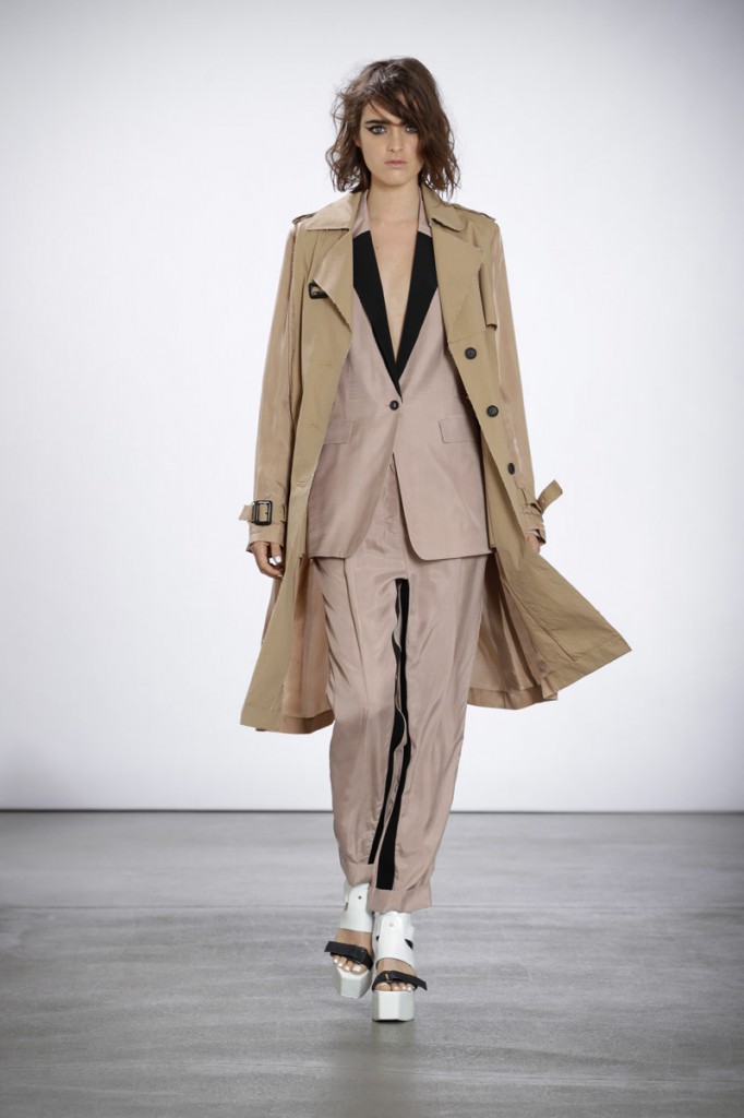
For the main summer collection we played with light colours and soft tailoring. There are trench coats with half silk, half cotton, tuxedo stripes on the inside of the pant, elephant leg pants, silk turtlenecks. We wanted a clean, crisp look with soft tailoring.
There’s always a twist in your designs. Would you say that that’s the signature of Avelon?
I always like to do something that is sophisticated and has an extra element that’s unexpected. I like to play with hidden details, things you discover from close up. It needs to create energy. It can be something small or big, but it has to happen. So yes, I think that’s something that defines Avelon. When I started with the label, I really looked inside; I didn’t look outside at what’s out there, but at myself. What are my strengths? My background? Who am I as a designer? So, having gone to St Martins, which is considered a very creative school, then working at Alberta Ferretti, followed by four years at Viktor&Rolf, both of which are luxury brands – that’s my background. But I’ve also been working at more commercial things, because I wanted to create a label that’s a bit more quick, sexy and fast. Looking back at my collections since graduation, I would always combine these two worlds, of luxury and the quickness of the street. And that’s what I built Avelon on, starting from my strengths and then developing it into a concept. You have to have a good foundation.
I always say that Avelon is “beautiful, different”, where the beautiful stands for the more high-end, sophisticated part in me, and the different stands for the street culture. Where these worlds meet, is where Avelon is based. Take for example the dresses with the sculptured zippers. We created a sculptural shape by sewing zippers on top of each other, with different tensions in the sewing machine. But something was missing, so I threw the denim dress with zippers and all into a bath of black dye, to get more of an attitude, mess with it a bit, get that energy in there.
How do you see the men’s collections in relation to this concept?
The menswear collections stand completely in relation to the women’s: it’s always based on the same concept, executed towards men. So it’s tougher, cooler, more masculine, and I really reflect it on myself. I like designing for men because the repertoire is more limited, so you have to make something out of almost nothing, whereas with women, you have an endless range of colours, shapes, materials… actually, for women’s, you have to create the borders before you start with the design!
Is there anything about Avelon that you’d say is Dutch?
People ask me if I see myself as a Dutch designer. When I got my B.A., I wanted to move out of the Netherlands as soon as possible, to get an international handwriting and get away from the typical Dutch design, which is often very practical. For interior design or architecture, Dutch functionalism makes perfect sense, but in fashion maybe less so. In the Netherlands we have a saying regarding garments which goes: “but can you sit on a bike with it?” I wanted to get out of that state of mind. On the other hand, there’s probably a side of me that wants to make things practical, to make this combination of innovative fashion and wearability. I don’t want to just make “the dream”, I want to make the dream come true! If I make a fur coat, I want it to be effortless, so one can wear it every day. Maybe that’s the practical side of me.
What can we expect from the winter 2014 collection?
We start every season with research; it’s good to go away, make room in your mind. The winter collection is inspired by a woman artist from the 1930s, and from early Japanese influences on Western culture. We started looking into that era, when women adopted a modern look which we dubbed “the boyish-cool”. Shapes are more square, there are textured pieces and some lace. We take inspiration from a moment in the past but we look forward, these ingredients are translated into the present moment, and the future.