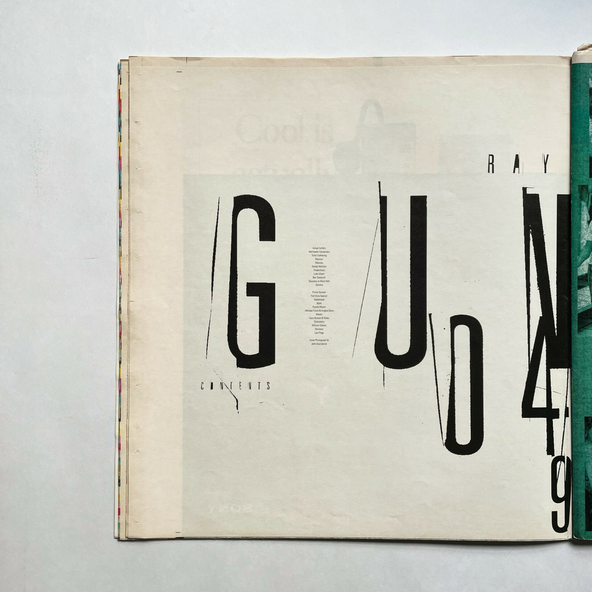
Chris Ashworth, 'RAY GUN 49,' 1997.
Chris Ashworth: My creative journey began where I grew up, in Liverpool. I left school without a degree. My sister had straight As in all her subjects; I was the exact opposite. My mother helped me find something she thought would interest me, and that’s how she got me into art. So I’ve always been interested in drawing. My grandfather was always drawing, too. My mother found me a class in Southport. Basically, it was a class that got you started. Then later, at a design college, I got onto a basic design course that I took for two years. After that, I took another course at York that focused heavily on the study of typefaces, especially in the last two years. I had great lecturers there who sparked my interest in typography. That’s where it all started, that was the beginning of my love for Swiss typography. Names like Emil Ruder, Müller-Brockmann, Wolfgang Weingart were – and are – my sources of inspiration. My influences all came from there. We just learned about structure, balance, negative space and sans-serif typography. We did projects for a designer wine label, but you had to draw everything by hand.
When I moved to Sheffield, and later to London, I was always surrounded by the street. The posters were flaking off in the rawness of the city. Then, all of a sudden, in the early Nineties you’d see guys like David Carson [art director of Transworld Skateboarding and later Ray Gun magazine] with his skateboard on the West Coast in magazines. And with the Cranbrook Academy of Art [an influential design school in Bloomfield Hills, Michigan], you suddenly saw more and more of them. When I was in my first year of college at York, there were no computers at all. So we were still working with our hands. In my senior year, they got these three Macs, which I hated. There was a girl in my class named Alison. I remember asking her to print out a typeface for me in negative, mirror image, so I could cut it up and use it. I asked her to do it because I didn’t know how to print, and I had no interest in learning. It seemed too complicated. There were a lot of people in our class who just sat at these computers. Once they had one, they sat at it all day. I was lucky enough to be able to cut up magazines for a good year.
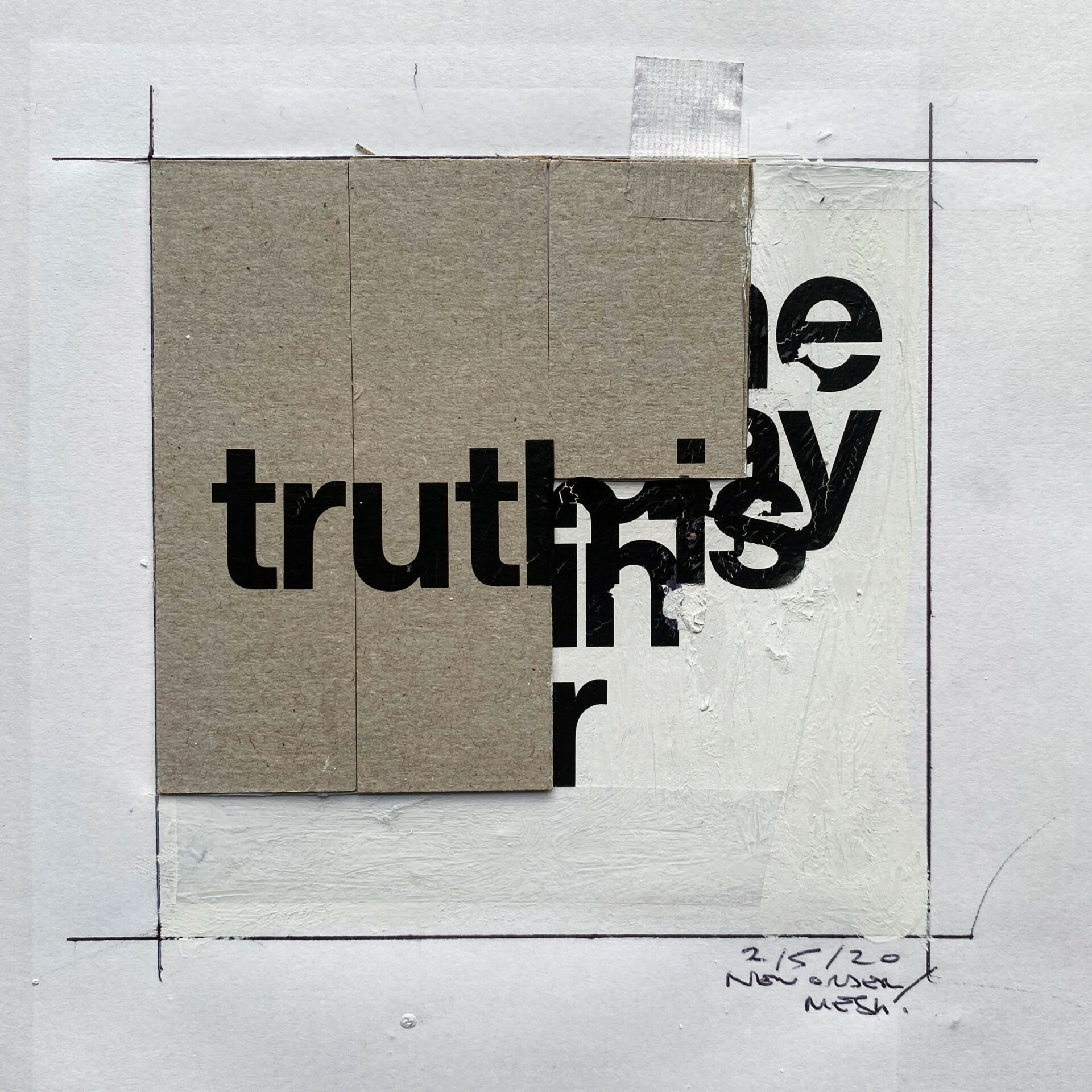
Chris Ashworth, 'New Order, Mesh,' 2020.
With my English-European upbringing under my belt, I wanted to bring some European style to the States. I’m a very spontaneous creative. What I wanted to bring was not the kind of Swiss Grid system [a Minimalist style Swiss design] I had been doing up to that point. It’s interesting if you look at my early work. At some point I got to where you can see all these European and Swiss influences, they merged into each other in a raw, more natural kind of sensibility. It wasn’t a conscious thing. I wanted to be true to its soul, which is to be unpredictable, because there’s a power in breaking the rules.
When I’m asked if my works are a commentary on reality or if they are an attempt to come to terms with all this chaos, I say I’m not trying to make a political or social commentary. Ultimately, I’m about communication. My way of doing things is to do them as emotionally as possible. That’s why I’ve always stayed away from the computer. To go back to the magazine example: the moment you start creating something, you create something really unique. I think that captures someone’s attention or inspires someone in a way that a computer never could.
There’s so much material out there. When I was taught how to do a layout, I was shown how to create an original one from existing magazines: that’s more than reusing something, it’s a new creation.
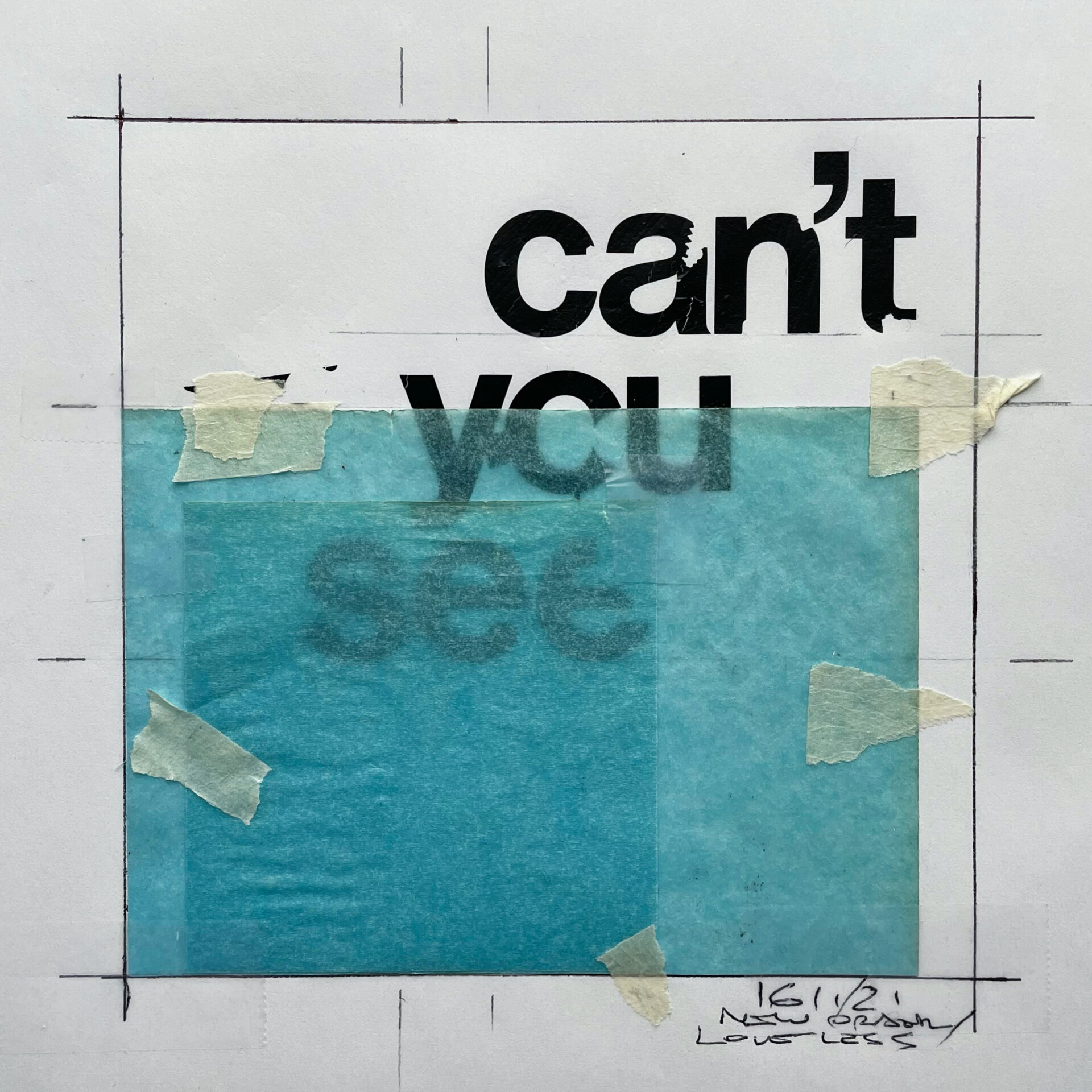
Chris Ashworth, 'New Order, Loveless,' 2021.
One of my favorite projects ever is my book Interference (1994). It was done in collaboration with John Holden, a photographer from Manchester who became a good friend. I did all these layouts in the evenings in my garret in Sheffield. We used all sorts of slips to make layouts. I had only been out of college for two years. He photocopied stuff I sent him by mail and then put them next to his photo. He thought these unfinished designs were the artwork – and that’s what the book became. Interference is full of things that began just as ‘clues’ for him. It was all handmade, and because of the pace of communication via mail, it was more original than we could have ever imagined.
I’ve been working in the corporate world for about 20 years now. I’m currently working on my book, which is supposed to be three volumes. When I wrote the foreword, I wrote about me and my wife. On Fridays, we watch a lot of music videos. We put on old ones from Glastonbury and NPR Music Tiny Desk concerts. The other night, I wrote about how I could live without design but not without music. I love New Order, Joy Division and Depeche Mode. The way those musicians write about love in their lyrics speaks to me. Whether it’s ‘Love Will Tear Us Apart’ (1980) or ‘Enjoy the Silence’ (1989), they’re all songs about love. Some of them are pretty twisted, some of them are pretty dark. The way they write about love just gets to your heart. It’s not cheesy, you feel connected to it.
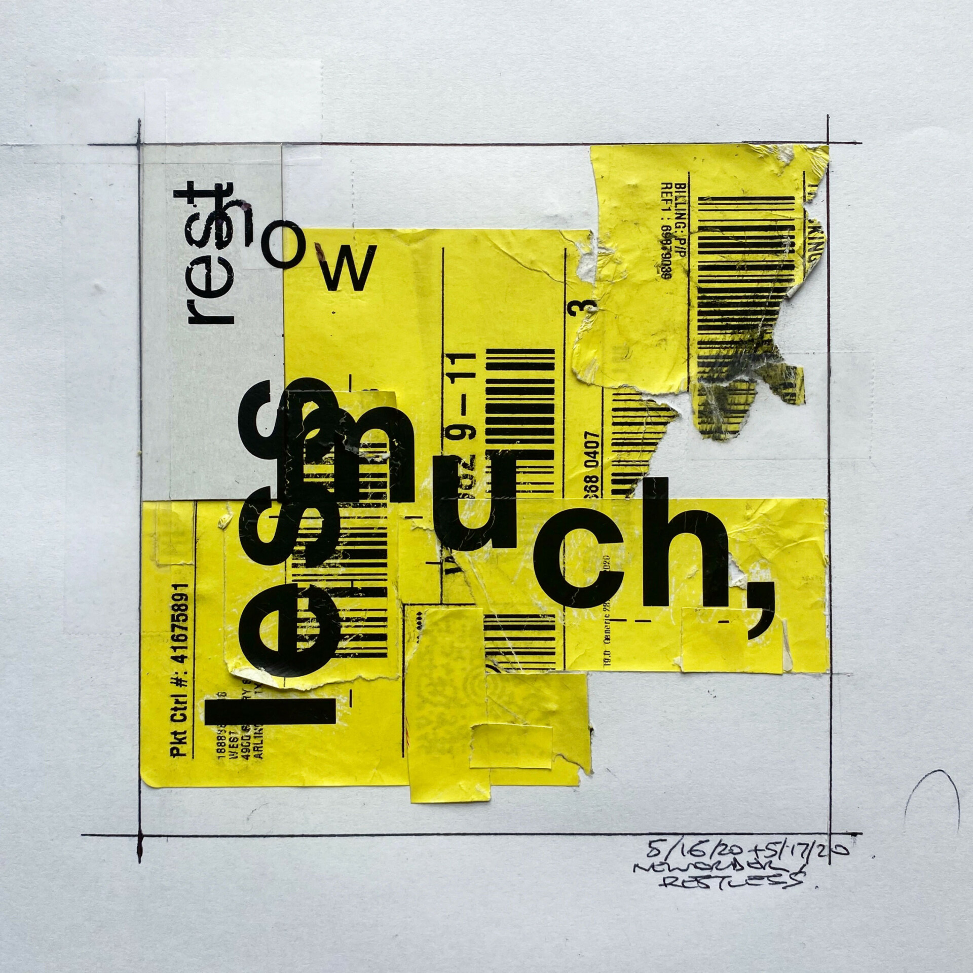
Chris Ashworth, 'New Order, Restless,' 2020.
Chris Ashworth is an English graphic designer. In addition to his work on Ray Gun, Ashworth also created promotional materials for the first MTV Europe Music Awards in 1994. His work on the brochures earned him more work with MTV, as well as work with Warner Music Group. Ashworth is inspired by Swiss design, and refers to his own style as ‘Swiss grit’. It is characterised by hyper detail, barcodes, horizontal lines and the use of multiple transparent layers. Ashworth regularly publishes books and has a cult following. His new book is coming soon.
As featured in SLEEK 72 – LOVE. Available in Print or Digital hier.